Yahoo! new logo is louder than before!
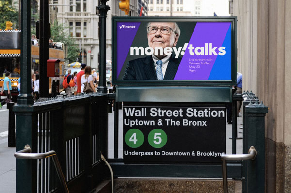
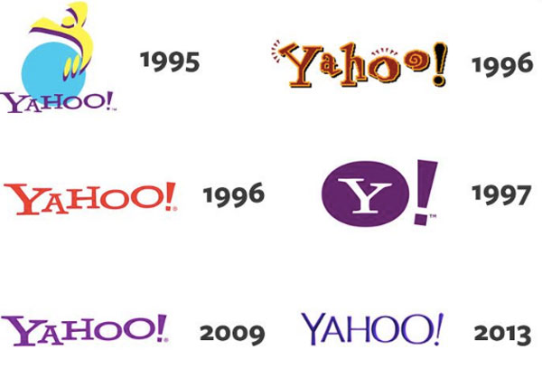
Pentagram has created a new logo for Yahoo! (now yahoo!). The full identity redesign is the first for the company since 2013, and the new mark hearkens back to the mid–1990's "Yahooooooo!" yodel design. The new design has a distinctly canted exclamation point that provides a quick visual greeting but also serves as a slash between the company name and the company's various division names, such as yahoo! Money or yahoo! Sports.

From the Pentagram website: "With its new products, Yahoo will empower users to better sift out irrelevant parts of the digital world, giving them more control of what they see and when they see it. The strategy positions Yahoo as an 'amplification brand,' amplifying the things that matter, helping to 'amplify you.' The idea is neatly visualized in Yahoo's exclamation point, a punctuation mark that literally stands for amplification."

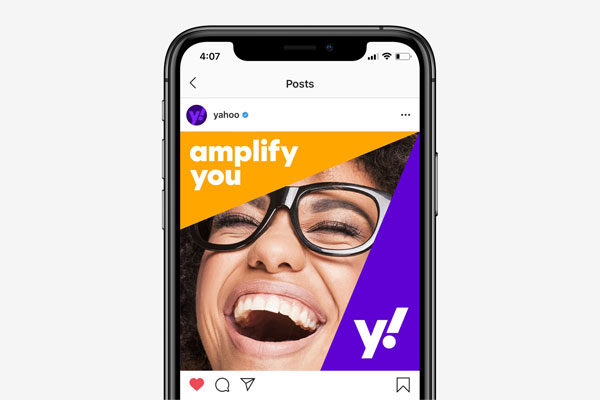
The system includes a new favicon that maintains the identity's personality in smaller applications and on social media. Another update is to Yahoo's signature purple: the central shade is a bright purple called "grape jelly," with two secondary purples called "hulk pants" and "malbec."